ByteEditor Website Builder
Add Individual Styling for Blocks and Elements
⚠ Note
You can add custom styles to individual content elements within your design theme.
Step 1
Choose the desired design theme. To do this, go to Design Builder and open the design.

Step 2
Open the Theme tab at the top of the page.

Step 3
Add a new styling: in the “variants” section of the theme JSON, add a variant named after one of the free slots: “inverse”, “accent”, “muted” or “style-4” to “style-9”. In your new styling, set the colours for design elements, such as the background, headings, borders, links and buttons. A styling can override the Content, Button and Button Secondary colours (see the full list of keys in Customize Colors); any colour you leave out is taken from the base theme.
Step 4
Click Save and publish on the design.
Step 5
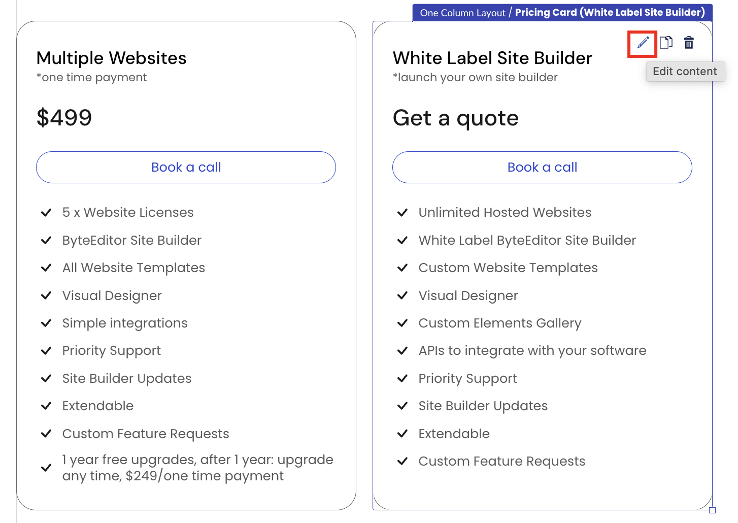
In the back office, add a new content element or edit an existing one. In this example, we are editing the existing pricing card.
Step 6
Scroll down to Styling and choose the desired style in the Theme Variant field. Only the stylings defined in your design are shown; click the selected card again to return to the base style.

Step 7
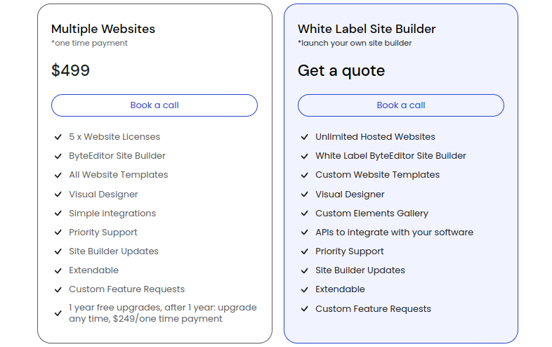
The selected style will be applied to the chosen content element (in this case, a pricing card).
Step 8
Click Save and publish on the page.