ByteEditor Website Builder
Check Responsiveness
Check the mobile view of your website
⚠ Note
You can view how your site appears on phone, desktop, tablet, or laptop using two methods: the integrated toolbar in the content window without saving, or Umbraco preview.
Integrated preview toolbar
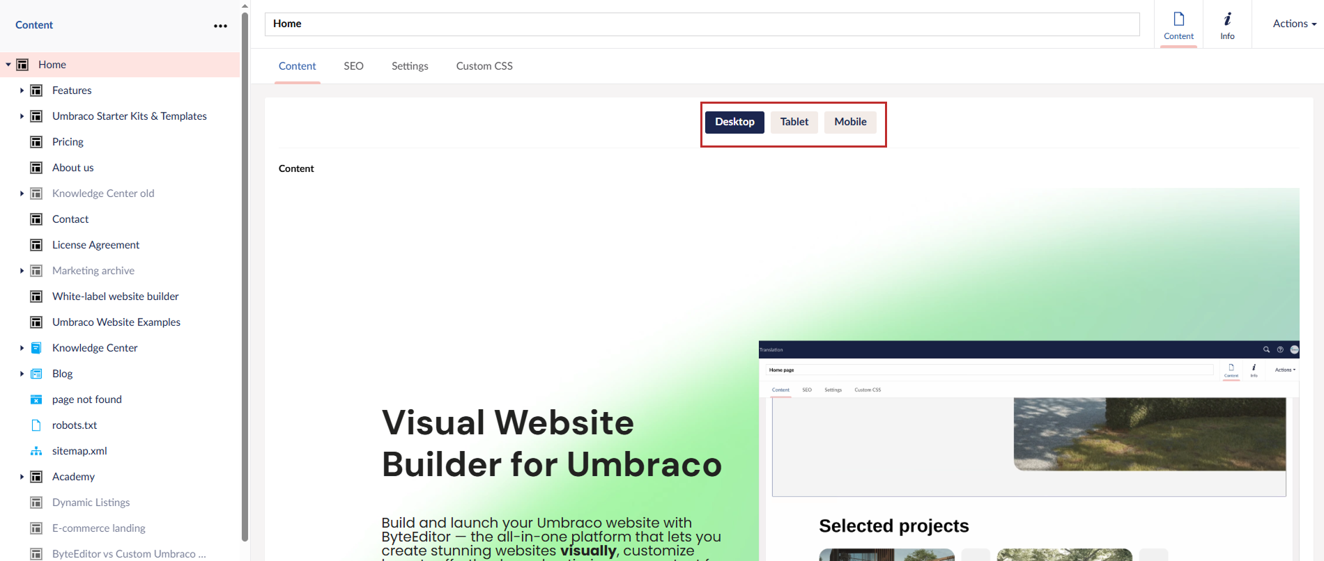
Step 1
Open any page with content or create a new one. A preview toolbar is located at the top of the page. To switch to desktop, mobile, or tablet view, click the corresponding button.
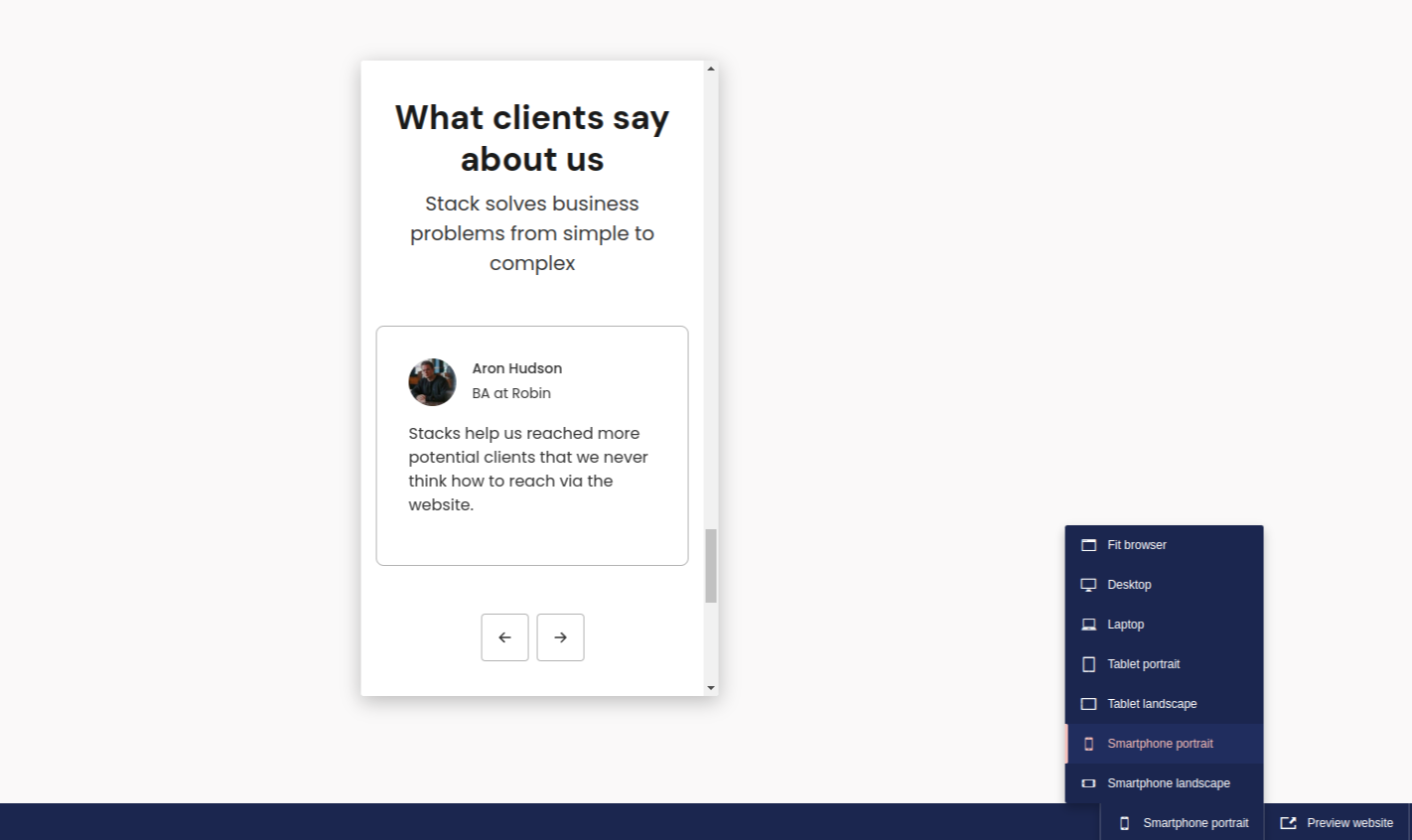
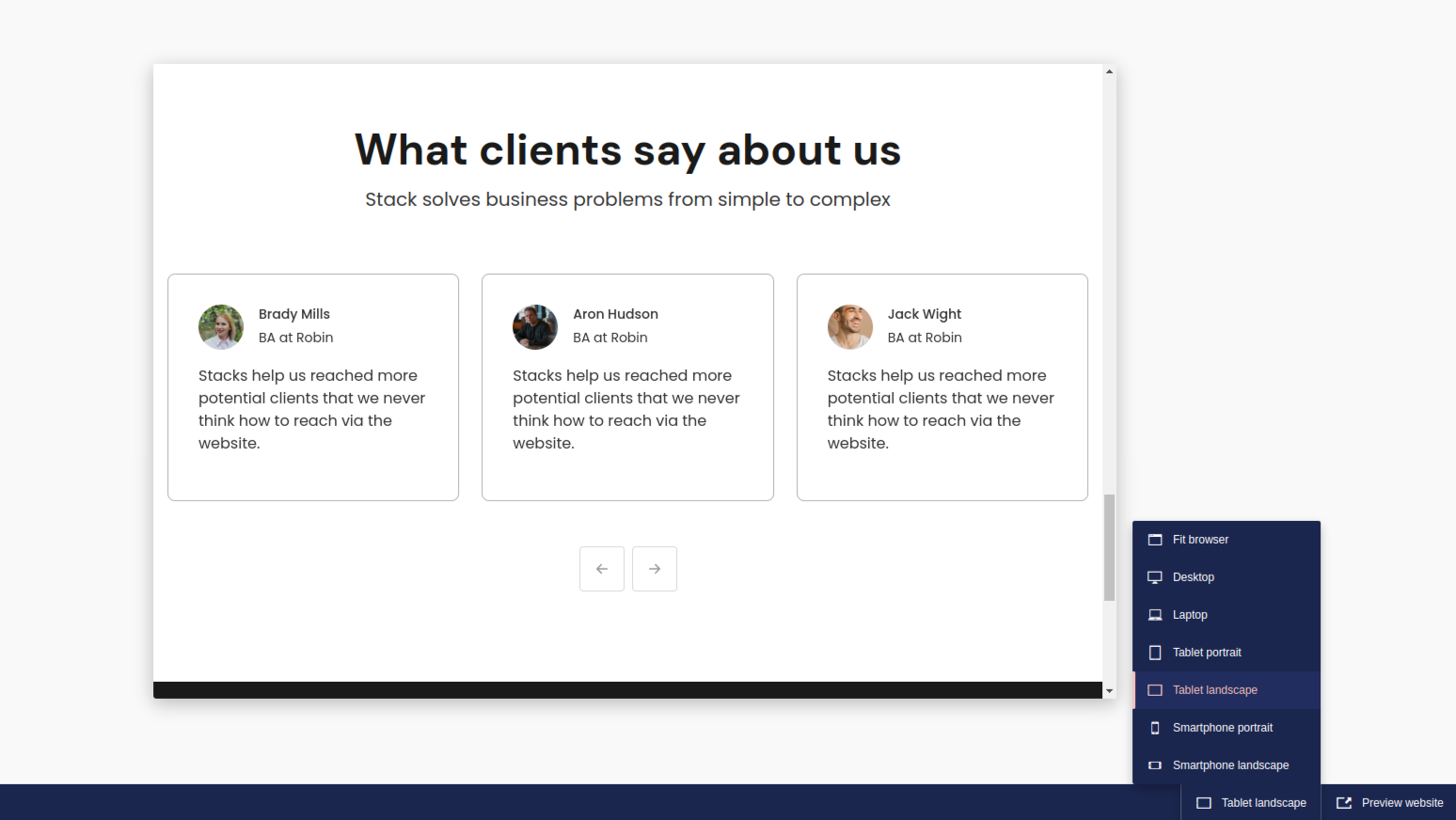
Check the responsiveness with Umbraco preview
Step 1
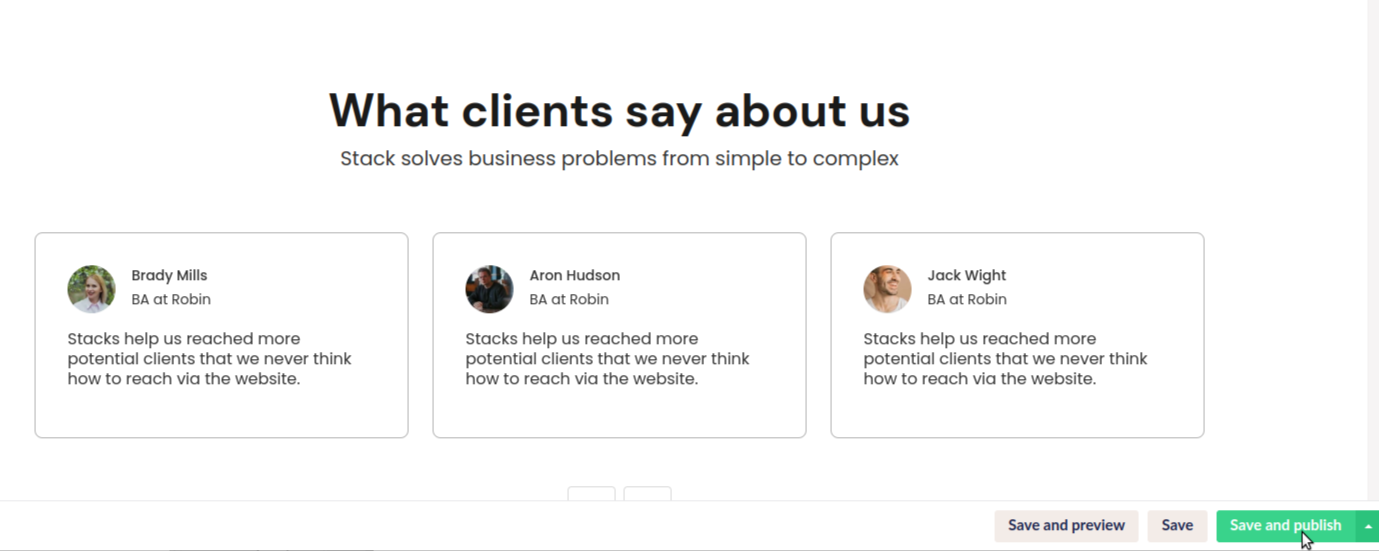
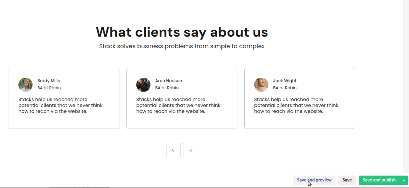
After arranging the content on your page, click Save and Preview in the bottom right corner.
Step 2
A new window will open with 7 preview options: Fit Browser, Desktop, Laptop, Tablet Portrait, Tablet Landscape, Smartphone Portrait, and Smartphone Landscape.
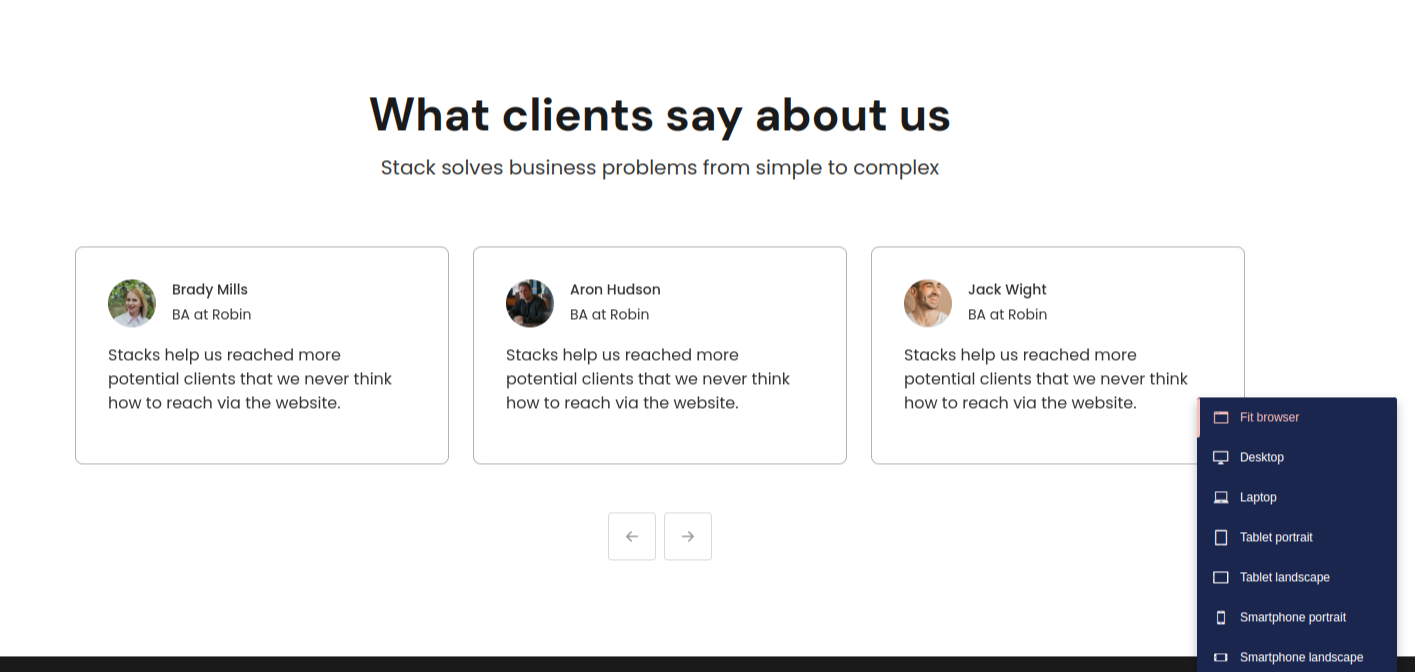
Step 3
Choose the desired preview option to see how your site will appear on that specific screen.
Step 4
If you're satisfied, return to the previous page and publish your site by clicking Save and Publish.